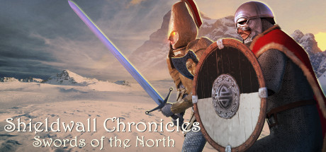
Shieldwall Chronicles: Swords of the North is a gripping, tactical RPG that lets you build a powerful band of adventurers and partake in a grand adventure.
175 Total Reviews
133 Positive Reviews
42 Negative Reviews
Mostly Positive Score
Shieldwall Chronicles: Swords of the North has garnered a total of 175 reviews, with 133 positive reviews and 42 negative reviews, resulting in a ‘Mostly Positive’ overall score.
Reviews Chart
Chart above illustrates the trend of feedback for Shieldwall Chronicles: Swords of the North over time, showcasing the dynamic changes in player opinions as new updates and features have been introduced. This visual representation helps to understand the game's reception and how it has evolved.
Recent Steam Reviews
This section displays the 10 most recent Steam reviews for the game, showcasing a mix of player experiences and sentiments. Each review summary includes the total playtime along with the number of thumbs-up and thumbs-down reactions, clearly indicating the community's feedback
Playtime:
839 minutes
super light on story but a fun tactical game
👍 : 0 |
😃 : 0
Positive
Playtime:
37 minutes
How not to make a good first impression: "ambiant" (ambient), "at any times" (time), "remainging" (remaining), "quiting" (quitting), "grants" (grant). That's from the options screen and the initial tutorial text.
How not to make a good second impression: have a tutorial that explains what's on the screen, pointing occasionally to blank space instead of a UI element, but doesn't actually tell you how to move units or attack. This would be less of an issue if the mouse cursor changed to reflect which action would be performed when you click, e.g. most games change the cursor to a sword or an arrow when clicking results in a melee or ranged attack. I've played enough games like this to be able to guess what to do, but the tutorial told me about a bunch of things that aren't yet relevant (command points, complex game mode) instead of telling me how to play. (If somebody asks to do the tutorial, assume they need it.)
Rounding third: when the tutorial tells you that there's a "quit" button in the pause menu, but it's not actually there during the tutorial. (That one's actually just sort of funny.)
Bringing it on home: right-click to bring up info on a unit and get a poorly-formatted info dump that feels like debugger output. The only way I found to determine the range of the basic attack of my units is to pop that open and scan down the unevenly-spaced lines to find the number. Then I get to count hexes. Again, changing the mouse cursor could help with some of that. (I'm guessing this was a straight port from a mobile platform.)
There are other weird things. I was mouse-hovering over the skill buttons to see what they did, and moved the camera position (WASD). The mouse cursor vanished and then reappeared in the middle of the screen. Every time I shift the camera I have to find the mouse again afterward. Sometimes when I click on one of my units it doesn't change focus. The game selection screen presents a collection of 24 buttons that say "in use" or "empty" with no other information (and they're all the same color, so in-use and empty sort of blend together visually); you have to click on them to get more information. Throughout the UI, the color and framing for buttons and panel headers is nearly identical, so I found myself trying to click on things that weren't actually buttons.
Part of my problem here may be that I just finished playing King Arthur: Knight's Tale. It's not a AAA game or a contender for GotY, but the controls and UI presentation are so much cleaner than this.
I played through the tutorial and tried the first couple of missions. The UI issues annoyed me enough that I gave up on it. I may come back to it someday, but I would recommend against it unless you have a high tolerance for poorly-executed UI.
👍 : 0 |
😃 : 0
Negative