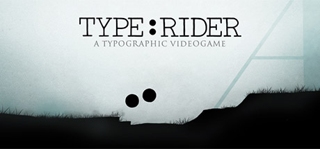
Type:Rider Reviews
In this platform game you embody ":" ready to travel through the History of typography, from it's origin to today! Overcome obstacles, escape your enemies and collect asterisks, but beware not to fall down! Will you come out of this journey unscathed?
App ID | 258890 |
App Type | GAME |
Developers | ARTE France, Ex Nihilo |
Publishers | ARTE France |
Categories | Single-player, Steam Achievements, Steam Cloud, Full controller support, Steam Trading Cards |
Genres | Casual, Indie, Action, Adventure |
Release Date | 6 Nov, 2013 |
Platforms | Windows, Mac, Linux |
Supported Languages | English, French, Italian, German, Spanish - Spain |

1 655 Total Reviews
1 316 Positive Reviews
339 Negative Reviews
Mostly Positive Score
Type:Rider has garnered a total of 1 655 reviews, with 1 316 positive reviews and 339 negative reviews, resulting in a ‘Mostly Positive’ overall score.
Reviews Chart
Chart above illustrates the trend of feedback for Type:Rider over time, showcasing the dynamic changes in player opinions as new updates and features have been introduced. This visual representation helps to understand the game's reception and how it has evolved.
Recent Steam Reviews
This section displays the 10 most recent Steam reviews for the game, showcasing a mix of player experiences and sentiments. Each review summary includes the total playtime along with the number of thumbs-up and thumbs-down reactions, clearly indicating the community's feedback
Playtime:
59 minutes
Fun game for those who like platformers. Soundtrack is relaxing, puzzles are fun and the difficulty is good. This game is not about shooting and killing, but to collect. I recommend this game!
👍 : 4 |
😃 : 0
Positive
Playtime:
245 minutes
If you are a decadent gamer like me, who sighs browsing through hundreds of their games and then celebrates the end of another day reading Wikipedia anyway... You can read the brief history of typography in an attractive form by playing this game, and as a side effect you will feel less guilty regarding the gaming backlog. Cool.
The game has very nice, intelligent art & visuals, good ambient music, covers interesting topics and has only rudimentary gameplay, maybe slightly irritating from time to time, to remind you that you are still playing a game.
Also, I noticed that kids like watching it a lot :) It's a great way to teach toddlers letter shapes.
👍 : 4 |
😃 : 0
Positive
Playtime:
420 minutes
The game could be good, it's based on a new idea and it's very nice to learn fonts.
But the controls are horrible (I played both with keyboard and with controller) and I often wondered if the game developpers ever played their own game.
Several time, your two-wheeled avatar just stay stuck on a corner, or against a corner, unable to get up to the pixel above and in front because when you jump you also wall jump and are pushed back... back in the void most of the time. And then you have to start again from a save point often very badly placed.
Also: the bonus level is not a bonus level. It's a nightmare. They tried to make something funny and "trolling". They got the trolling part right, but that's it. The difficulty is nightmarish, you get back to the beginning every time you fail (even at an inch of the finish line). That shouldn't be a bonus level, it should be a "Hardcore mode"
And the cat chasing you the whole level is too much. Waaay too much and way too fast.
I don't recommend this game. Shame because the idea was fun.
👍 : 14 |
😃 : 1
Negative
Playtime:
246 minutes
Think a little deeper before you type with TYPE:RIDER!
TYPE:RIDER is an art experience/puzzle platformer about the history of fonts, printed word, and text. That sounds boring, yes, but it really isn't if you enjoy learning about really obscure, weirdly specific things - and I enjoy learning about really obscure, weirdly specific things. You embody the punctuation mark : (colon), riding about the text-based levels like a tiny punctuation motorcycle doing nifty tricks and solving quite simple puzzles. Along the way, you collect letters, asterisks (*), and ampersands (&), which teach you something about the font-named levels you go through. For example, did you know that Clarendon and Slab Serif occurred because typewriters distorted earlier fonts? They weren't designed that way on purpose. Or did you know Helvetica was created in the 60's and 70's? I sure didn't until I played this game, and probably never would have thought to ask.
This game is remarkably well-polished for how small it is - I encountered little to no glitches, except one where my : got stuck on a letter in such a way it couldn't get free. The controls are simple, smooth, and easy, however the platforming can be surprisingly challenging at times. Gameplay feels like the old flash game WOne or Sonic the Hedgehog in places, but the puzzles compare to other physics-based puzzle platformers. This is a simple Unity-based game, after all. The puzzles are simple as pie, making this game a great one to relax with and go your own pace in, while also making you think in different ways about using the font-based landscapes to your advantage or use - some areas have you hooking onto thin lines with :, some have you wall-jumping, and one even has you playing classic retro games like Breakout and Tetris. I also enjoyed the bonus level, I would have never ever thought to appreciate [spoiler]the much maligned font Comic Sans MS[/spoiler] if not for that (shockingly tricky) level. The cheap price tag on this game makes it affordable for anyone looking for a short and sweet game where getting most of the achievements is fairly easy if you are willing to explore and look for them. It's great for completionists but offers a fair amount of challenge for achievement hunters, so be ready to work for it.
All in all, this is a fine little gem of a game that I found on a whim one day while queue-browsing. It takes about four hours to play through completely, but sadly offers little replayability. That's fine, it doesn't need to be more than what it is. Really, buy this game, buy your friends this game, it's a short and sweet little experience that you can even learn some history from. If you're anything like me, I don't think you'll be disappointed in what you find here. :)
👍 : 2 |
😃 : 0
Positive
Playtime:
178 minutes
As a graphic designer, I am an admirer of great typography. This game, with its subject matter and beautiful style, was easy to take a chance on. In the end: Is it informative? Very. Is it beautiful both in terms of audio and visuals? Extremely. Is it fun? Not really.
For me, the control (especially jumping mechanics) just never felt quite "right". That is easily the biggest source of frustration in the game. While some sequences are downright inspired, others are grit-your-teeth annoying.
The informative nature of the game and the actual gameplay seem at times to be at odds with each other. For example, unlocking an informative page gives you a prompt to view it immediately - while I recommend doing this since the visuals and audio in the portion of the level you are in will be tuned towards this piece of info, it halts the gameplay and can break the pacing. In addition, occasionally the game will destroy you as soon as you return to the gameplay and cause you to have to replay the small sequence again. It feels like a punishment for doing what the game is designed to have you discover.
In the end, I just can't recommend the game.
👍 : 84 |
😃 : 0
Negative
Playtime:
132 minutes
This game was hella cute and relaxing. You play as a colon adventuring through text, collecting all of the letters A-Z, *'s, and 1 hidden & on each. It's not very challenging or long, but enough to be engaging and interesting. Pretty cool game.
👍 : 9 |
😃 : 1
Positive
Playtime:
64 minutes
I really wanted to like this game, since I was getting interested in typography.
Unfortunately, my experience with it was frustrating.
+ Visuals.
+ Music.
- There's no 1920×1080 resolution.
- Game doesn't save any settings. With every new launch you have to start over.
- If you change the sound settings, the sounds may disappear completely and you have to restart the game.
- If you minimize the game and change sound settings in system, the sound disappears as well.
- If you minimize the game, the physics gets messed up.
- If you reset any settings, it resets all of your progress also.
- If you accidentally press "space" while being in between levels, you can't continue unless you replay the last level.
- It is unclear which one of the dots you're in control of and it gets confusing.
- Educational part is not included in gameplay, you have to stop and read the book if you're curious.
- Book parts are being unlocked too quickly and unless you wish to interrupt the game process to read, you have to read a lot at once once you finish the chapter.
- There are arrows to scroll the book, but they're not clickable. You have to use keyboard arrows or mouse wheel, but they're slow.
👍 : 6 |
😃 : 0
Negative
Playtime:
235 minutes
It's Limbo, but with absolutely terrible controls, and instead of a kid traversing a neverending stream of nightmares, you're a colon flailing and stumbling through the history of typography.
It's much better than it sounds, actually. I'd give it a 10/10 in presentation and originality; It's one of the best art games I've seen. All the educational passages are optional, but you'll still gain a deeper appreciation of typographical history even without reading any of them, thanks to the fascinating stage designs.
The controls are annoying and imprecise, and the last few levels are stupidly hard, and on rare occasions the physics can glitch out and get you stuck. But none of that really bothered me; there's no real pressure to perform well since there is no consequence for death, and checkpoints are numerous. Just relax and enjoy the awesome trip through history.
All the achievements are easy. Most are for 100% completeion. The hardest one has you going through a paricularly annoying level without dying, but it's still pretty easy thanks to some tricks. For achievement hunters, this game should be a no-brainer. You'll have it done with in 4 hours or less.
I loved it. I wish were there more games like this.
👍 : 15 |
😃 : 5
Positive
Playtime:
464 minutes
[h1]Something of an artistic experience // Recommended for a casual night in[/h1]
+ Includes unlockable, interesting history of typography entries
+ Soundtrack is immersive and surreal; one of the game's better selling points, and every track was perfectly suited for the stage
+ Ambient sound design, also, is superb
+ Level designs are unique and make for excellent platforming
+ Controlling two inseperable dots makes movement through the stages a bit more challenging, but it does so in a refreshing way that the player will surely enjoy
+ Respawns are frequent, and the game typically throws the player at the last safest place before their untimely death; robs the player of much of the frustration typical of the genre
+ In addition to the individual level design, each collection of stages is vastly different from the other; furthermore, they become more and more interesting as the player moves through the game
- Little replayability once having attained all of the achievements
- One of the achievements requres the use of a Facebook or Twitter; this may not be a problem for the majority of the players, but speaking as someone who has neither, I detest that this is a requirement
[h1]LockeProposal's Big Day Out[/h1]
[url=http://steamcommunity.com/groups/bigdayout#]Community Group[/url]
[url=http://store.steampowered.com/curator/7611703/]Curator Page[/url]
[url=https://www.reddit.com/r/SeriousSteamReviews/]Serious Steam Reviews subReddit[/url]
👍 : 28 |
😃 : 0
Positive
Playtime:
728 minutes
First off: This is meant to be an educational experience, if you don't like 'games' like this move on and don't read further.
The levels are composed of letters of whichever font you're playing, and they look gorgeous.
Everything is simple, yet aesthetic. The music fits, spot on. I was surprised on how everything works so well together. Each world has their own theme that reflects the font (and the era it's from). For someone like me, who didn't really know anything about font history, Type:Rider was truly informative. It never seemed boring and always kept my interest.
The only downside I can think of, is that sometimes the physics seem a bit off. Otherwise well worth a buy, defenitely while it's on sale.
👍 : 84 |
😃 : 0
Positive