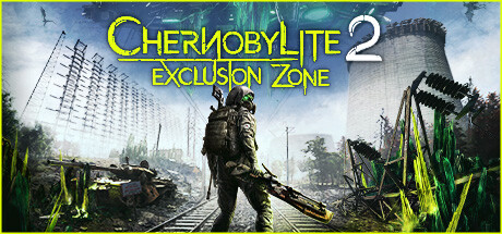
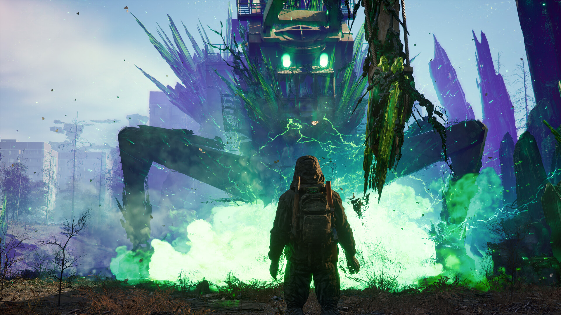
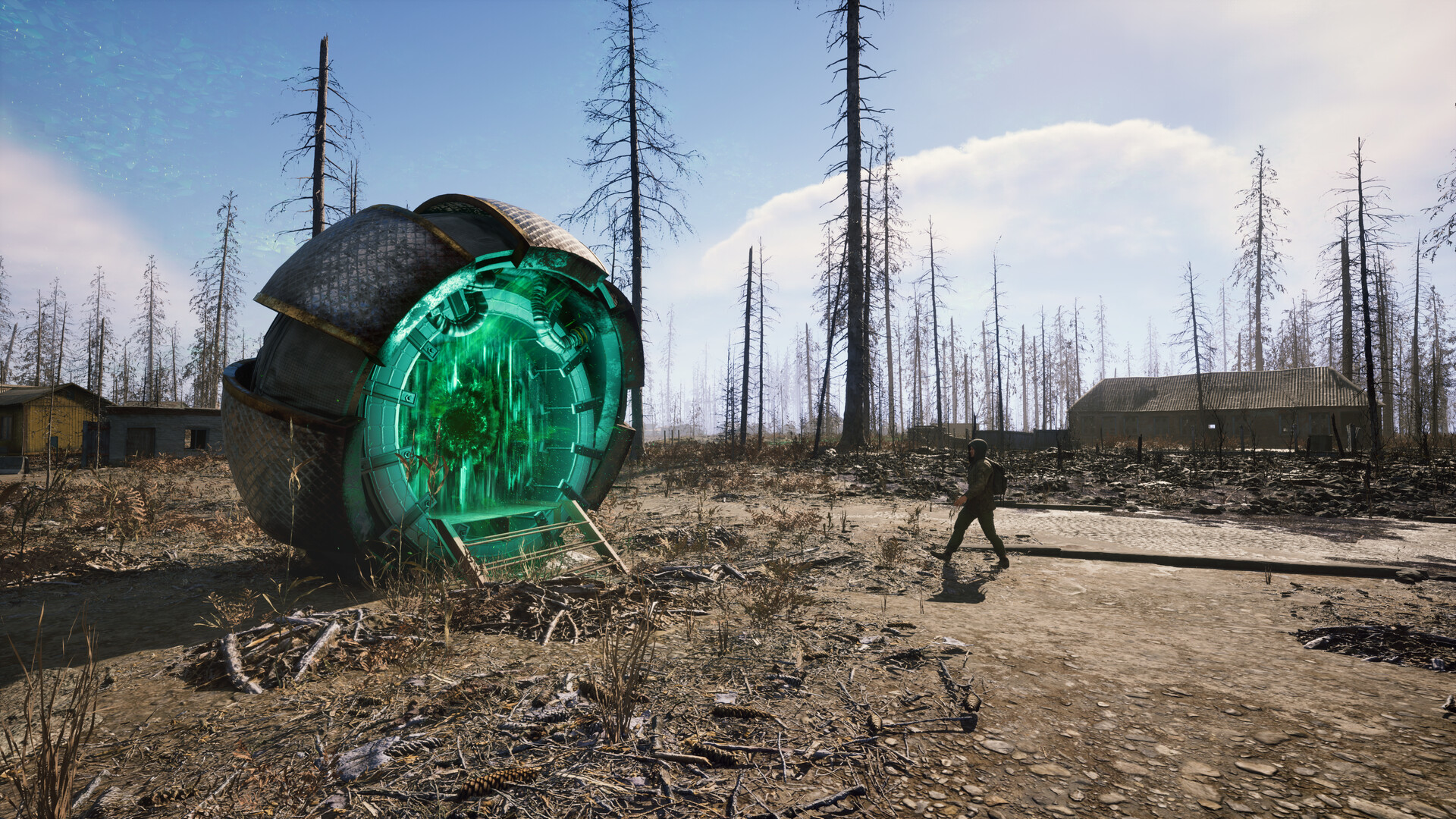
Explore the mysterious open world of the Chornobyl Exclusion Zone in this post-apocalyptic action RPG adventure. Craft your story by facing sinister hazards and monsters. Survive furious encounters with the help of your crafted weaponry, developed skills, gathered teammates, and supported factions
473 Total Reviews
300 Positive Reviews
173 Negative Reviews
Mixed Score
Chernobylite 2: Exclusion Zone has garnered a total of 473 reviews, with 300 positive reviews and 173 negative reviews, resulting in a ‘Mixed’ overall score.
Reviews Chart
Chart above illustrates the trend of feedback for Chernobylite 2: Exclusion Zone over time, showcasing the dynamic changes in player opinions as new updates and features have been introduced. This visual representation helps to understand the game's reception and how it has evolved.
Recent Steam Reviews
This section displays the 10 most recent Steam reviews for the game, showcasing a mix of player experiences and sentiments. Each review summary includes the total playtime along with the number of thumbs-up and thumbs-down reactions, clearly indicating the community's feedback
Playtime:
79 minutes
Mega Patch 03 is good, but need more improvements and contents
👍 : 1 |
😃 : 0
Positive
Playtime:
31 minutes
Ehh its fine if you expect it. Honestly, the og Chernobylite felt better. Like it felt like real life and it was just better. The game is still in its early version so I hope the devs make it a better experience for 40 dollars. The original game felt way more Chernobyl and the weapons seemed better compared to this game. I was seeking an experience similiar to stalker 2 like open world, wide weapon selection, and good graphics, the game has an open world I heard and the graphics seem good. But I am not sure about the weapon selection. If the game was cheaper than I would not complain but the 40 dollars wasted have to be worth it.
👍 : 4 |
😃 : 0
Negative
Playtime:
46 minutes
I like many here loved the first game. I was a little worried when we had the teaser trailer and showed some kind of third person action rpg but I was still excited and tried the demo as soon as it was available. It was in a wordc rough.
Thankfully I can now report that the game while still not perfect is already in a much better place and the effort the team has put towards appealing to the players is already clear as day.
optional first/third person perspectives with the ability to switch at will, much better performance, and refining of the games core systems.
I recall all too clearly the first game sitting on my wishlist for a long time in early access leaning towards mostly negative but eventually turning it all around and blowing me away when it came out as a polished unique game of a quality I did not expect.
I have faith the devs can do the same thing again and while I was unsure of their swap to third person on launch I still think they have a unique and grand idea for a game here and I can't wait to watch them see it through.
👍 : 5 |
😃 : 0
Positive
Playtime:
2025 minutes
this game is awesome . is early release so changing and at times glitchy but well worth it i cant wait for the full release and them to finish out the story:)
👍 : 5 |
😃 : 0
Positive
Playtime:
139 minutes
I played first Chernobylite on console and really loved it. The second part raised my doubts when announced and released in early access but after last update I watched on trailer that devs changed many things and now it's a right sequel so I tried and I can say I'm very happy.
Chernobylite 2 plays like the original one just with more options and more freedom in gameplay. The world is bigger and there's more things to do. The story evolves in interesting way. RPG elements on broad scale are natural evolution considering the scale of the new game.
Even in early access the game feels much bigger and rich than the first part.
The optimization feels OK, no stuttering on my RTX 3090 pc.
👍 : 5 |
😃 : 0
Positive
Playtime:
198 minutes
Feels like a really janky amalgamation of different games. Bit of Elder Scrolls mixed with STALKER, Elex, and of course the first Chernobylite. It's been decently enjoyable for the time I've put into it. There is a lot of work to be done but has me interested to see the end goal and product. Seems to run decently well on my PC maxed out (4070-S, 5800X3D) but have noticed a bit of hiccups here and there and some performance degradation over time. Decently fun if you're willing to go with the Eurojank and EA jank.
👍 : 4 |
😃 : 0
Positive
Playtime:
88 minutes
They took everything from the first game... removed the good things and decreased the performance - at least on my system - in it's current state not even close to be recommended...
It may change when full release - but for now buy the first game instead.
👍 : 16 |
😃 : 0
Negative
Playtime:
332 minutes
The saying "can't tell cool stories if no one makes it home to tell them" means that the firefight is secondary to survival. The firefight is important, indeed, but . . .
there is a reason ground troops carry so much equipment that they may not necessarily use- it is because they want to 1)have the tools to 2)use the tactics that will 3)bring them home.
This is a survival game to me, even though i have very light experience in it so far.
The vibes are "you gotta live to make it home to your family" type energy.
No, I am not picking berries and eating them every five steps like in Ark, or rock-boiling water for forever to be able to not die of thirst in real life, but there is a touch of that feeling adrenaline-high/going-into-shock-clarity that insists that you survive- even if it is just in a pixellated landscape.
It is not the horror/scary aspects of the game, or the landscape, or the character design, etc. It is all of these things and more that make you feel like you just "want to make it home." And that feeling hooks into the story itself, leading you along with both hope and despair in your hands, and using both to overcome the situations you find yourself in.
The experience-so-far inspired me to draft a poem whose relevance to this review is to convey the feelings I get when in game:
dawn sunbursts
green-hued gray
picture perfect
world away
astringent bandage
burning lace
adept adage
about-face
hide and seek
weeping bride
sorrow sold
telling lies
empty coffin
coughing nails
before nightfall
turning pale
let them loose
nocturn wails
amble 'round
far we roam
broken corner
tumbled stone
rocket-bled
home sweet home
bullet tumble
spray parade
chernobylite
green-hued gray
carry us
now, Away
beyond sunset
under foot
cough salvation
charcoal soot
wily caverns
echo names
tell somehow
now, Away
breaking breach
smoking gun
breathing deep
powder lungs
galvanized
till this day
crowd and gather
bow to pray
silver secret
pendulum
never now
never run
finding purpose
blinding bright
seeing clearly
blinking twice
muzzle flash
masked beneath
charcoal mine
wherein you seek
answers fleeting
nothing right
every heart
burning lace
charcoal breath
blushing bride
about face
left with nothing
left to die
left to rot
left to lie
left to turn
green-hued gray
ending age
freak parade
empty sparkle
blinding deep
taking time
fall to sleep
purpose lost
morning light
prophet mist
foghorn smite
marching cadence
punching brick
red-brown blood
synthesis
all is right
now is not
when is then
steaming hot
leaning stark
sanity lost
bereavement found
without cost
-empty cauldron
weaving webs
turning tides
wax and ebb
wholesome whisper
isotope
blushing bride
shunned elope
fruitful curtains
casket mask
taking turns
setting task
whereupon
fissile might
speaking truth
chernobylite
👍 : 8 |
😃 : 3
Positive
Playtime:
316 minutes
I would approach Chernobylite 2 as a lore booster, I appreciate the way it incorporates a more Roadside take on zone interactions, at times seeming to have references to Doomed City as much as the Picnic. Some of the game play will turn off veterans of the zone but if they are open minded they can view this game as another approach to the Chernobylite we know and love rather than a replacement of or evolution of it per se.
The game engine is fairly reminiscent of the Chernobylite remastered/ enhanced edition release which means its still an intensely beautiful game, one of the more photogenic renditions of the zone for certain. As for fighting, rather than leveling up the Dr. from the first game, you are in the NAR's boots so you pick a class, specialize and behave accordingly. That is different from the first game but its not "BAD" it is simply showing you the pov of NAR. I would say like running Opposing Force after finishing the first half life.
Building in base is better than ever and voice acting is in a great state in the release. Some graphics are a bit uncanny/ terrifying eyes but that's never something we can patch or mod. Fighting is kinda harder tbh but very rewarding, in the old game of course we could build a super gun and make it easy, in this one its more like how would you manage fighting and supplying yourself in a limited scope?
Interesting new PDA tablet, scanning items with it is pretty cool, I wish I had some agency over what I scan etc. For example scanning for... buried treasure or something.
👍 : 7 |
😃 : 0
Positive
Playtime:
301 minutes
Has little to do with the first game, and that's good. It feels fresh within the Stalker genre and the devs are really ambitious with their vision. Still needs work but I recommend it.
Чики-брики
👍 : 21 |
😃 : 0
Positive
Chernobylite 2: Exclusion Zone Minimum PC System Requirements
Minimum:- Requires a 64-bit processor and operating system
- OS: 64-bit Windows 10 / 11
- Processor: AMD Ryzen 1600X / Intel Core i5-7600K
- Memory: 16 GB RAM
- Graphics: Radeon RX 580 8GB/ GeForce 1070 8GB/ Arc A380
- DirectX: Version 12
Chernobylite 2: Exclusion Zone Recommended PC System Requirements
Recommended:- Requires a 64-bit processor and operating system
- OS: 64-bit Windows 10 / 11
- Processor: Ryzen 7 7800X3D / Intel Core i5-12600K
- Memory: 16 GB RAM
- Graphics: Radeon RX 5700 XT / GeForce RTX 2070 SUPER/ Arc A770
- DirectX: Version 12
Chernobylite 2: Exclusion Zone has specific system requirements to ensure smooth gameplay. The minimum settings provide basic performance, while the recommended settings are designed to deliver the best gaming experience. Check the detailed requirements to ensure your system is compatible before making a purchase.